Technical Slop
Navigation
Displace
Considerations
Solid
Channels
Circle Grads
Gradients
PSD
Curve It
Tweakables
Scans
Broken China
Bulge
Math 1
Math 2
Heat Waves
Reflection Maps
Power Distort
Other
Cannify
Extrude
Whispies
AMP
Brush Making
Picking Colours
13 Revisited
Levels
Pixel Shuffle
UVW 2
Pui Pui
Light Rig
The BulgeThis one is a lot of fun. Real simple effect, but suites our purposes for edification. Our aim with this one is to bulge the center in a horizontal manner. Sounds like fun to me. First thing. Our D-Map is a PSD and we will be treating it as such. It is just so much easier this way. Non-destructive for the most part and makes tweaking a breeze. So, in your Preferences, make sure that you are saving a composite with the PSD. Very important. Let's start with some concept. |
|
But the horizontal Displace is interesting. None across the top, none across the bottom, but maximum in the center except in the vertical center. Make sense?. |
|
I get the feeling that things are about to get complicated. |
|
So why do it this way? Why the Layer Mask with Grey underneath? You would have to ask that, wouldn't you? Let's say that there isn't a Layer Mask and we just use it as is. That would expand our target graphic/photo horizontally. Right? Right. But we want that to fade as we move up or down from the center, hence Layer Mask. Okay, pretty simple, but there is a problem with this as it is -- it's sharp. We would end up with two points on the ends and we are after something smoooooth. That's the other reason for the Layer Mask -- we need something to Curve. Aha! Now it's all starting to come together. Sure, we could get funky with an extra Layer Blending modes, but that would rob us of the full use of the Curves dialoge. Doh! Okay. That's enough of that. Let's move on. Hopefully you've got your D-Map all prepped and ready to go. Mine is 300 x 300. Ideally, it would be 256 x 512, but that's a different story. But I said we were moving on. Let's look at our raw Layer Mask. Hold Alt and click the Layer Mask thumb. You should now be looking at a simple mirrored gradient. White running through the center with Black across the top and bottom. Now for the fun part. Let's run Curves! (I always get excited at this part.) |
|
|
|
I actually tried doing this with Spherize, but it just wasn't working for some reason. Which is really odd because Spherize can be used sometimes instead of Curves. Anyways... |
|
This is our New and Improved D-Map. Very similiar to the original concept doodle, except it's smooooth. Let's save as a PSD and Diplace. |
|
Here is our target. Cheap, eh? Well, hit Displace and start playing.
|
|
|
|
I finally settled on Horizontal: 50%. I left Vertical at 0%. Very not bad. A lot of work for a simple effect, perhaps. Maybe someday you'll use this little trick. Bah! You'll prolly never use it. But the point of this is in the building blocks. While you might not use this effect specifically, you just might use a small piece of it someday. Kudos. |
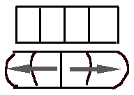 This
is what we will be looking to do. Take something like the top and Displace
it into something like the bottom. Vertically, no Displace.
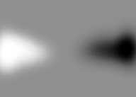 That
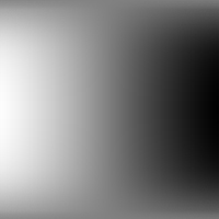
means our D-Map will look something like this. Just a real rough draft
to help visualize. Once we get working, things will be real smoooooth.
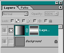 This
is the plan of attack for building our D-Map. The Background is Grey.
There is a Layer above it with a simple gradient. This Layer also has
a Layer Mask with an equally simple gradient.
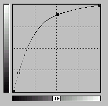 Something
like that. The idea is to get it to look likea quarter circle. Mines not
perfect, but it works sufficiently. There is a way to get it perfect using
an Arbitrary map, but that's for another day. For now, just eyeball it
and it should be fine.
 This
is what the Layer Mask should now look like. Lots of White in the middle
and some Black across the top and bottom. Pretty damn snazzy, if you ask
me.
 Ohhh...
Ahhh...
